27 Feb 2019
The many ways of constructing a SQL query
 The Dell DVD store is a fabulous online resource to test SQL skills
Photo from Pexels
SQL or Structured Query Language has emerged as a critical requisite for data scientists to know in addition to statistics, and machine learning algorithms. And that is rightfully so. For a data scientist to work his/her ‘magic’, he/she had to access data. Most businesses tend to store their data in relational databases - and SQL just happens to be an efficient means to get the data we want!
What is a relational database?
A database based on the Relational Model of database management created by Edgar F. Codd, based on the mathematical foundations of set theory and logic. With this background, relational databases store data in the form of tables that have various fields (columns), containing elements of the same kind and records (rows), which are collections of different fields for one individual entry. Data stored in these tables are usually related to one another through selected fields (foreign keys) and are separated to minimize duplication and store data efficiently. The major advantage of the relational databases is the ease of data retrieval with SQL queries, which utilize the underlying mathematics of the database model to return the data that you want.
It is a good idea to learn SQL - which is fairly logical to follow given its underpinnings (see above) - from a number of good resources found through a google search (Try W3 Schools for a start)! And once your basics are in place, it is great if you had access to a relational table for you to test and exhibit your SQL skill-set.
The Dell DVD store
The Dell DVD store is a great open resource for a relational database of an online e-commerce website. The set of 8 relational tables comes with codes to implement any one of the different flavors of SQL. In my case, I chose to implement it in PostGreSQL on an AWS instance, and query it either directly in the psql implementation on the instance or through a Jupyter notebook using the psycopg2 PostGRESQL adapter for python. For more details on how to setup an AWS instance with the Dell DVD store data check out my GitHub repo.
Once you set it up, you can test your SQL skills by asking interesting questions! However, for this particular blog post, I focus how to calculate the median of a distribution using SQL, in particular the myriad ways of creating a median SQL query!
The missing aggregator?
SQL has some basic aggregation methods available - MIN, MAX, COUNT, AVG and SUM with which you can summarize most stats, but there is nothing set up specifically for calculating the median.
Median
The median is defined as the quantity lying at the middle of a frequency distribution of ordered values. Or in other word, it is the middle value that separates the upper half from the lower half of the data.
So for a distribution of numbers like (1,3,3,5,8,9,10) the median would be 5. However, if we had an even number of values like (1,3,3,5,8,9), the mean would be the average of 3 and 5 which is 3 + 5 = 8/2 = 4.
So one of the crude ways to calculate the median for a field in SQL is to order values in ascending order and select the top 50% of the values (plus 1, if the total number of values is even). This list can be then reversed (ordered in descending order) and can either select the top value (for odd number of values) or select the average of the top two (for even number of values).
I have used the total amount in the orders table as an example to highlight. Here the crude SQL sample query:
SELECT AVG(totalamount) as median
FROM
(SELECT *
FROM
(SELECT totalamount
FROM orders
ORDER BY totalamount
LIMIT 12000/2+1) as q1
ORDER BY totalamount DESC
LIMIT 2) as q2
This gives us the median value of the amount purchased in every order - $219.54
PostGRESQL offers us a few other ways to calculate the median, of which we will try three other methods.
OFFSET and FETCH
In a manner similar to the method used above, we can use the OFFSET method to omit a certain number of rows and FETCH the NEXT x rows. So for the median we omit the first 5999 rows and select the next 2 rows in case of an even number of rows (or next one in case of odd).
SELECT AVG(totalamount)
FROM (SELECT totalamount FROM orders
ORDER BY totalamount
OFFSET 5999 ROWS
FETCH NEXT 2 ROWS ONLY
) AS x
ROW_NUMBER
This is an interesting approach where you create a subquery with the total amount, a field of row numbers for all rows in the ascending order and another for row numbers in the descending order. The main query selects the average of the fields where the ascending row number is between the corresponding value of the descending row number +/- 1. This would result in the selection of either the middle value for odd row numbers or the two middle rows for an even number of rows. The SQL query is listed below:
SELECT ROUND(AVG(totalamount), 2) as median_totalamount
FROM
(SELECT totalamount,
ROW_NUMBER() OVER (ORDER BY totalamount) AS rows_ascending,
ROW_NUMBER() OVER (ORDER BY totalamount DESC) AS rows_descending
FROM orders
WHERE totalamount <> 0
) AS x
WHERE rows_ascending BETWEEN rows_descending - 1 AND rows_descending + 1
PERCENTILE_CONT
Introduced in SQL server version in 2012, and incorporated into PostgreSQL since 2014, this is a nifty way to calculate the median. It calculates the 50th percentile (which is the median), as a continuous function (the _CONT part). What that means is that it will interpolate in case there are multiple values. Now, PERCENTILE_CONT will calculate the median in the context of a grouping (the WITHIN GROUP part), which is used to order the list in an ascending manner. If there were further partitions that needed then you could use the window functions - OVER and PARTITION.
SELECT
ROUND(PERCENTILE_CONT(0.50) WITHIN GROUP (ORDER BY totalamount)::numeric, 2)
AS median_totalamount
FROM orders
In case you were wondering what the ::numeric did - it is the same as CAST - it changes the data type to numeric so that ROUND can do its magic!
So, in conclusion…
We took a look at the different ways in which median can be calculated. However, it is important to keep the performance in mind. Not all SQL queries are equally efficient when dealing with huge amounts of data. The OFFSET/FETCH method is supposed to be more efficient than most methods, with the worst performer being PERCENTILE_CONT (see this blog post for performance comparisons)!
Happy SQL learning!
- AWS EC2
- PostGRESQL
- Python and psycopg
- Jupyter Notebook
- Bash scripting
- Command line interface (CLI)
Check out my GitHub repo for more details regarding the project, codes and results!
15 Oct 2018
Determining the price of an Airbnb rental in Chicago and the factors that influence it
 Photo from Pexels
Airbnb has been growing in popularity over the years - to a point now - where it has emerged as a viable alternative to hotels. It is especially alluring to travelers who are looking for cheaper yet comfortable accommodations - while looking to experience a distinct local flavor. And the popularity shows.
A quick check of the search trends for the Airbnb website Google Trends shows a steady increase in its popularity over the past five years.
(An aside: watch this space for a companion piece on time-series modeling of the Google trends data using Facebook’s Prophet.)
Google Trends data on the web searches for the Airbnb website for the past five years.
So as a part of the second project in the Metis Data Science Bootcamp, I worked on getting data about Airbnb listings in the Chicago area to try and predict what factors influence their pricing.
Scraping the data
In 2007, three young entrepreneurs started what was at the time called Airbedandbreakfast.com. Since then, Airbnb has not only shortened its name, but has expanded to more than 34,000 cities and as of 2016, had been used by more than 60 million guests. The company is currently the second-highest valued startup in the U.S. at $31 billion.
Business Insider
The $31 billion kitty for Airbnb comes from their commission ranging from 3-12% of the rental price depending on the listings. But, what features of the host’s offering helps set the price of their rentals (and which features dont) was the main aim of my analysis.
To identify some of the features to model the price of the rental, i turned to what the host’s thought were the top selling points of their offering that would entice a potential customer to choose them. I scrapped their descriptions and created a wordcloud to identify the most common features advertised.
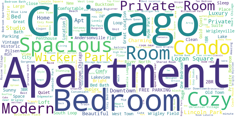 The most important features in the host’s own words.
Interestingly, some of the main features that are highlighted here are the bedrooms of the rental offerings, which could be private rooms, apartments or condos, and entire houses. Another key selling points seems to be the location of the property.
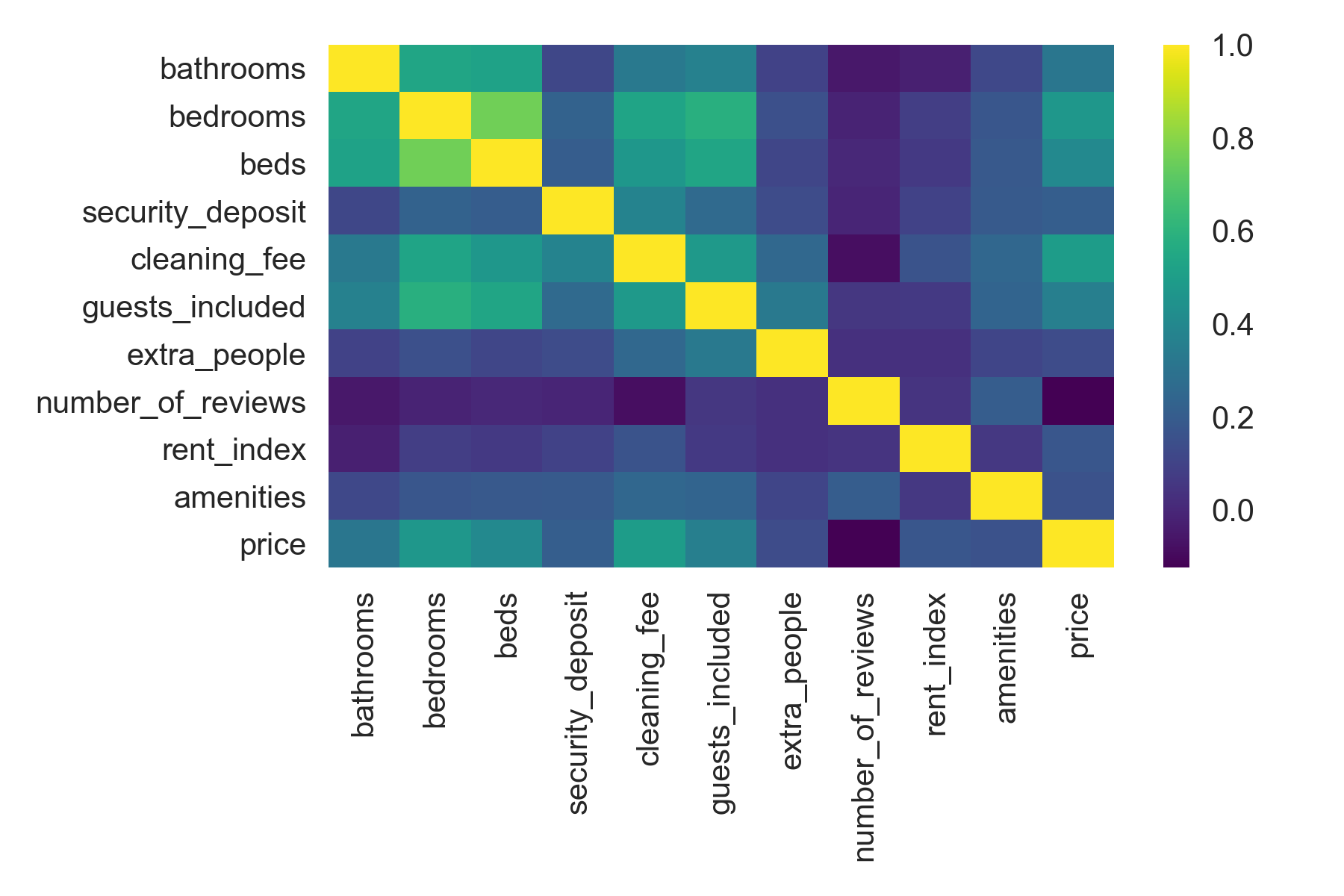
Based on this analysis and a study of almost 51 different features offered by the host, I whittled the list down to 10 variables that could best predict the rental price using the Variance Inflation Factor (for an explanation of the VIF and how it was used to select features for predicting how drugs are prices, read the blog by the King of Scraping, Charlie Yaris).
Is the price right?
 10 best features used to predict the price of an Airbnb rental.
The features and the price of the rental were fed into a linear regression model to see if they could predict the price of the rental. The resultant model was not one of the best, as the model scores (R^2, for the technical audience) indicated, but there were some interesting takeaways from the analysis.
Firstly, the number of bedrooms and baths clearly had the biggest influence on the price of the rental. For every bedroom offered, the host could charge $23 more per night. So, $46 for two bedrooms, $69 for three and so on. Add to it $10 more per bath added. As a result, entire homes and condos fared better than private rooms.
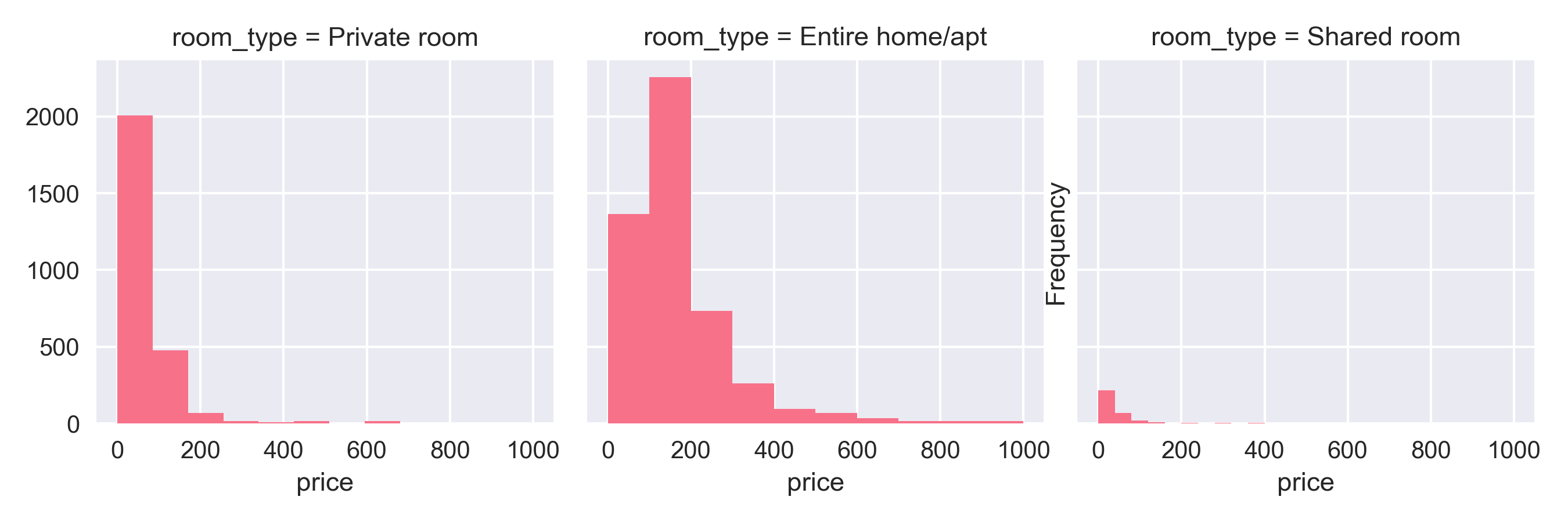 Entire homes pulled in a bigger share of rental prices compared to private rooms.
Although the location of the rental seems to matter in the preliminary analysis, the model did not corroborate that observation. One possibility the median rental prices in a zipcode I used as a numerical proxy for the role of a location in rental pricing may not have been the best measure. However, I did get some interesting results about rentals along transit routes in Chicago, which will be the subject of another blog! So stay tuned!
The curse of a review?
Superhosts are hosts who have been offering up their homes for a considerable period of time, and have consistently earned good reviews. One would assume that these superhosts could demand a better price for their rental compared to normal hosts. But, that was not the case!
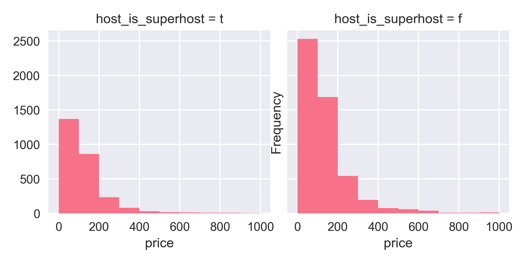 Highly reviewed superhosts do not earn more.
This trend was evident in the correlation plot which also showed that the number of reviews a rental received did not track the price of that rental. However, why that would be the case, is still unclear.
- Python : for most of the cleaning and analysis
- Pandas dataframes
- Beautiful Soup
- Selenium
- Wordcloud
Check out my GitHub repo for more details regarding the project, codes and results!
Next Steps
Off to week four and classification problems with SQL! Keep an eye on this blog for more updates in the coming weeks! I leave you with some interesting quotes from some truly learned people!
Interesting Quotes
“It has become appallingly obvious that our technology has exceeded our humanity.”- Albert Einstein
“Never trust a computer you can’t throw out a window.”- Steve Wozniak
“Simplicity is about subtracting the obvious and adding the meaningful.”- John Maeda
01 Oct 2018
Takaways from Exploratory Data Analysis using NYC MTA Turnstile data
 Photo by Jamie McInall from Pexels
Week one of the Metis Data Science Bootcamp saw us wade neck deep into analyzing data - in its full glory, and I kid you not - it was messy! But the final outcome was something, which as a rank newcomer - I was proud of!
This project was designed such that we would face the rigors of understanding the data, clean it and analyze it to come up with recommendations for a fictional client. Women Yes Women Tech (WYWT) International wanted us to analyze the MTA Turnstile data to suggest where to place their street team of volunteers to maximize sign-ups for their cause and increase attendance in their summer gala.
Now, why MTA turnstile data, you may ask.
NYC MTA turnstile data
In 2016, average weekday subway ridership was 5.7 million, the highest since 1948. Annual ridership was 1.757 billion.
MTA info
Given this ridership, it should come as no surprise that the data from the turnstiles - that register the traffic through the New York subway system at each entrance of each station every four hours - would be ideal for our analysis. Given the rather low response rates (10-12%) for external surveys, identifying stations with the highest footfalls could yield a good conversion rate, i.e, more donors to WYWT’s cause.
Given that WYWT would hold their gala in summer, we pulled out the turnstile data for the months preceding it, from March to May and used it for our analysis.
Based on our cleaned-up data (maybe I should go over how we did all that in another blog post?), we came up with a list of top stations with the highest footfalls. We focussed on the number of exits from any given station, as we inferred that people would be more amenable to chatting with volunteers at their destination.
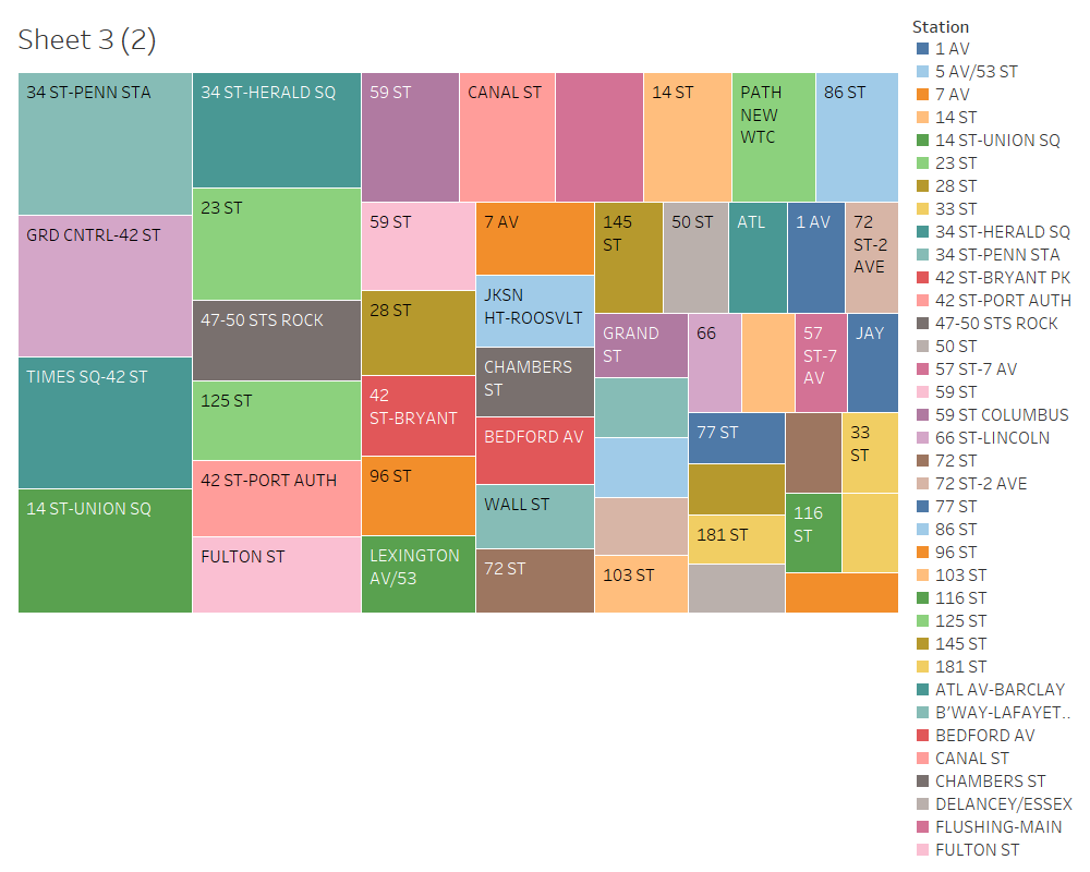 Top MTA stations based on the turnstile Data
The income angle
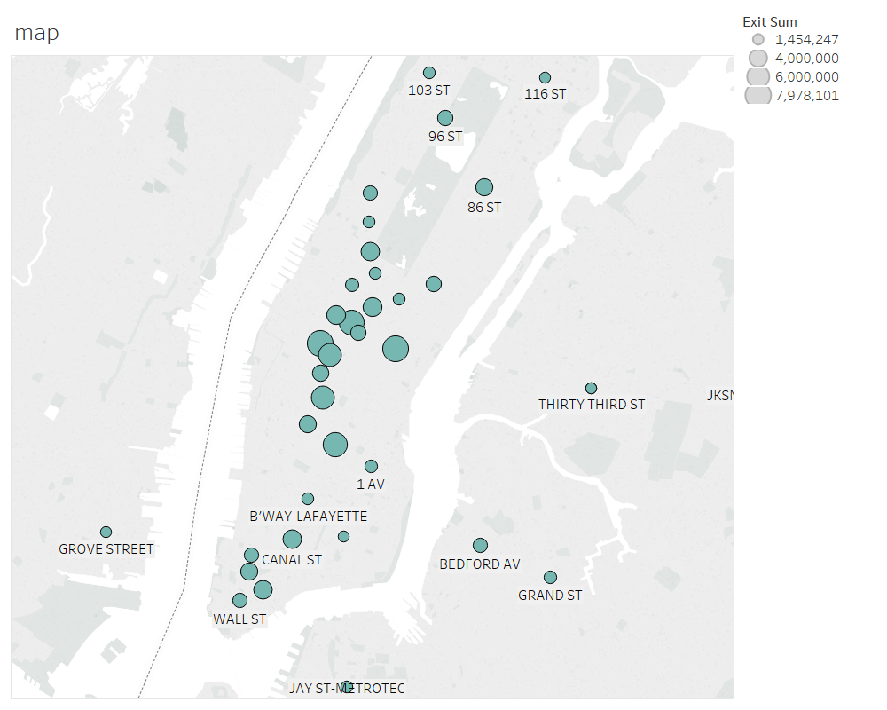 GPS locations of the top MTA stations that we selected. Larger circles indicate more foot falls.
WYWT is looking to expand on its donor base through the street campaign, so we decided to add income data from Kaggle (household income data), to supplement the footfall data and get more meaning into our analysis.
We identified the zipcodes around our top stations and mapped the income distribution around these locations.
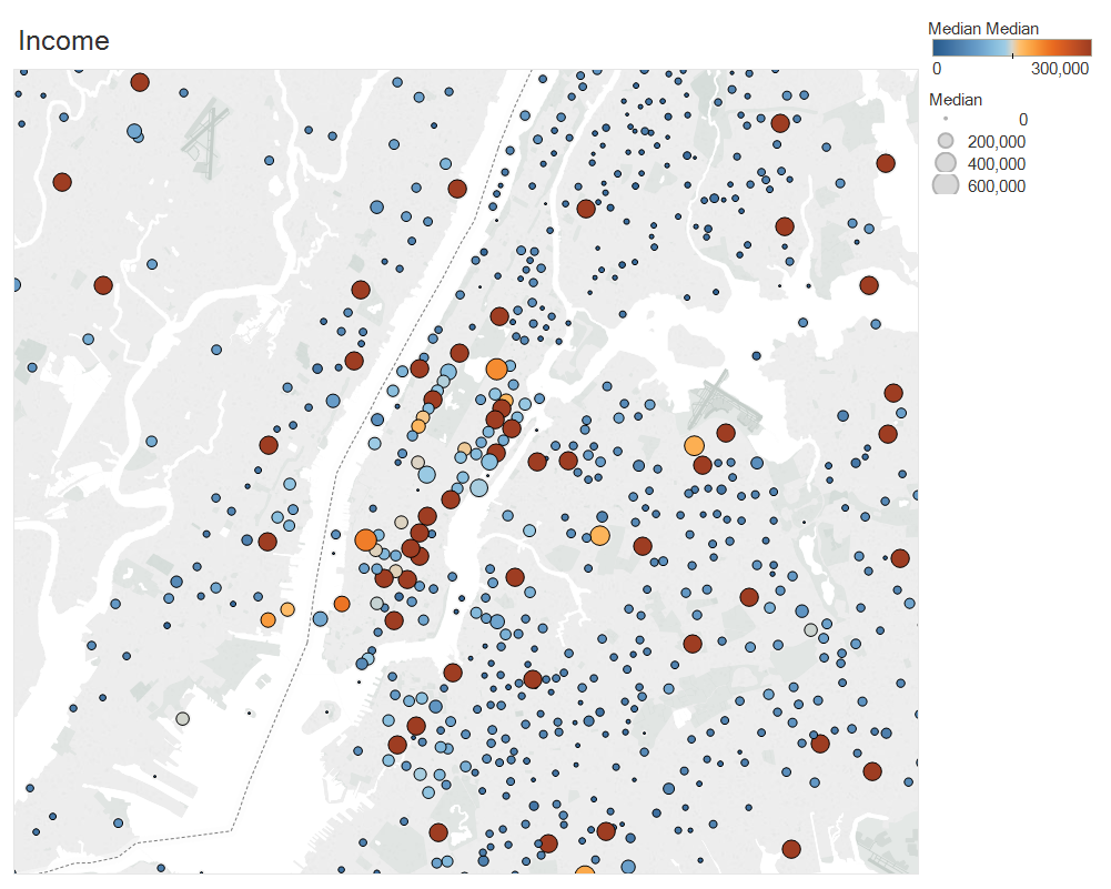 GPS locations of the income distribution. Darker circles indicate higher incomes.
We also devised a simple algorithm that mapped both footfall and income data into a single function, adding weights to each component so that we could tweak the recommendations towards either income heavy stations or footfall heavy stations, based on the client’s preference. For more on that checkout my cohort-mate and project team member Tim Bowlings’s blog here.
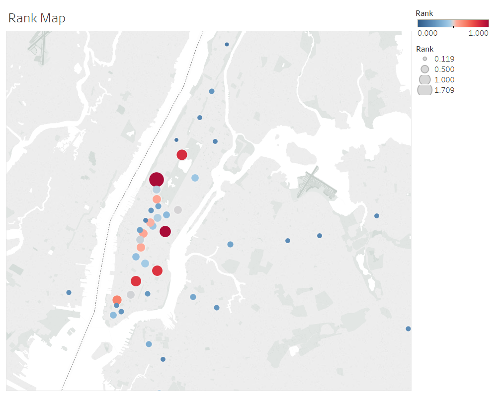 GPS map of top ranked MTA Stations based on the combined income and turnstile data.
Our recommendations
-
List of top fifty stations based on our combined income and footfall ranking system.
-
Mondays and Fridays are the best days for positioning street teams at the exits of the stations to maximize their impact as the ridership peaks on those days.
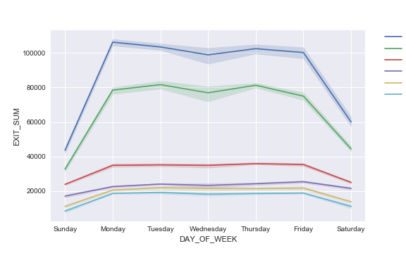 The turnstile data was separated by the days of the week and aggregated over the entire period of 13 weeks to give rise to the distribution of exits over the days of the week for selected stations with the shadow being the 95% confidence interval around each line plot.
Note: Wednesday traffic seem to be fluctuating more than any other day for the period we analyzed.
- Python : for most of the cleaning and analysis
- Pandas dataframes
- Matplotlib
- Seaborn
- Tableau
- GeoPy
Next Steps
Off to week two and web scraping! Keep an eye on this blog for more updates in the coming weeks! I leave you with some interesting quotes on data from some truly learned people!
Interesting Quotes on Data
“It is a capital mistake to theorize before one has data.”- Arthur Conan Doyle, Author of Sherlock Holmes
“Torture the data, and it will confess to anything.” – Ronald Coase, winner of the Nobel Prize in Economics
The world is one big data problem.”- Andrew McAfee, MIT scientist
01 Oct 2018
My personal journey towards Data Science.

A Molecular Biologist and Biochemistry PhD by training, I have over a decade of research experience under my belt.
However, classical molecular biology has, in recent years, evolved technologically, to generate terabytes of digitized data – resulting from genomics and proteomics experiments.
About five years ago, I diversified from my core field into genomics and proteomics, which necessarily involved data analysis. I began learning the R language and using it to analyze data sets. My foray into data analysis led to my appreciation of the appeal and power of using R not just to operate on datasets popularly termed as ‘big data’, but to also extract meaningful, statistically-significant analysis.
I published my research results in the journal Nature, and followed it up with another publication in Nature Communications. These experiences got me interested in learning how to harness the power of data analysis, particularly with the advent of AI techniques in understanding biological data. And this is just data academic research.
Currently, the healthcare industry offers a treasure trove of data in the form of patient database - measurements, images and diagnostic tests - that could amount to 80MB data per person each year. Add to it, fitness data from iPhones and fitbits, government websites (CDC and FDA), insurance claims and other health records – that is a mind-boggling amount of data to sift through, analyze and make sense of.
Expert estimates peg the health data analytics industry to touch $24 billion by the year 2020. And with good reason – such investments in the health care industry will decrease healthcare costs for the patient and improve overall well-being of the population as well! Besides, this will bode well for businesses too.
It is evident from literature survey that supervised and unsupervised machine learning are widely popular and being applied to categorize the vast plethora of viruses and in grading tumors based on their molecular signatures. But this is just the beginning.
This data-driven transformation is not restricted to biology or the health care industry alone. The broad scope of inquiry using data – particularly continuous streams using IOT – will place data analysis as a sought-after skill set.